You have a logo. You have brand colors. You even have approved fonts.
But that doesn’t guarantee your flyers, social media posts, and presentations will look like they came from the same organization.
Each piece may use the correct brand elements, but something still feels disconnected.
That’s where a graphic style comes in.
Creating a Recognizable Look
A graphic style is the visual language that connects your marketing materials. It might include distinctive shapes, patterns, illustrations, photo treatments, or ways of arranging content. It also establishes how those choices work together across different types of communications.
These elements give your team a starting point for creating different materials without having to invent a new look each time.
And a graphic style doesn’t have to make everything look identical. The goal is to create enough consistency that people recognize your organization, with enough flexibility to communicate different messages to different audiences.
Finding More in a Familiar Symbol
Bergen Family Center serves people across generations, from young children and families to older adults. The organization already had a logo featuring a tree, but no established graphic style to connect its communications. Without that guidance, staff were creating materials that lacked a shared approach to design.
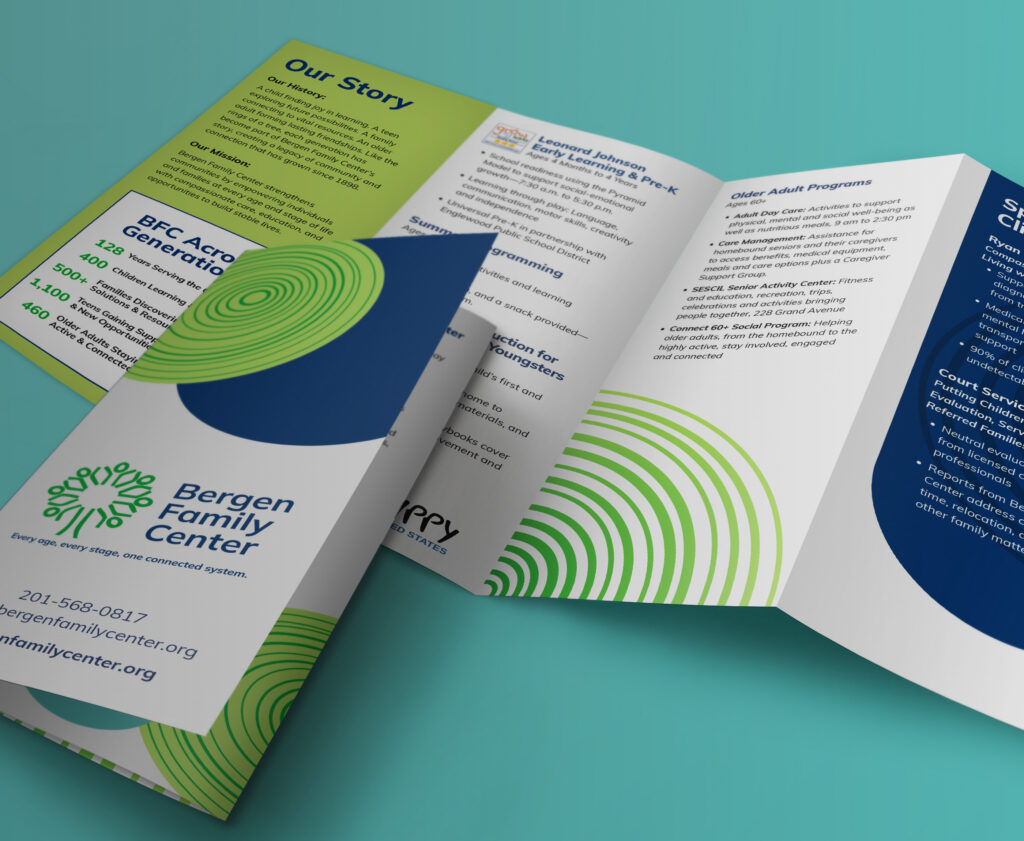
As we worked with Bergen to refine its visual identity, we saw an opportunity to build on the tree in its existing logo by incorporating the idea of tree rings.
The number of rings reflects the different age groups Bergen serves. Programs focused on younger audiences use fewer rings, while those serving older adults use more.
Beyond identifying programs, the rings can frame content, create backgrounds and add visual interest to materials. This flexible system gives each program its own character while maintaining a recognizable connection to Bergen’s larger identity.
A Consistent Look and Feel
Achieving consistent design doesn’t always require a rebrand.
If your existing logo still represents your organization well, you may be able to build on what you already have. The opportunity might be in creating graphic elements, establishing layout approaches, and defining how the pieces work together.
The next time you look at your marketing materials, don’t just ask whether they’re using the right logo, colors, and fonts.
Ask whether they look like they belong together.
If your materials are missing that connection, let’s talk.