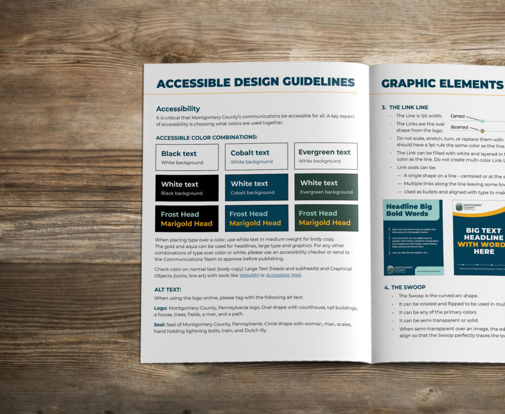
Everyone has an opinion about color.
You like green. Your executive director prefers blue. Someone on the board thinks a brighter shade would make everything pop.
Color shapes how people see your organization. It can make your communications easier or harder to read. And a shade that works beautifully in one place may not work as well somewhere else.
The challenge is choosing colors that reflect your organization’s identity, work for your audiences, and give you the flexibility you need across your communications.
When Green Isn’t Just Green
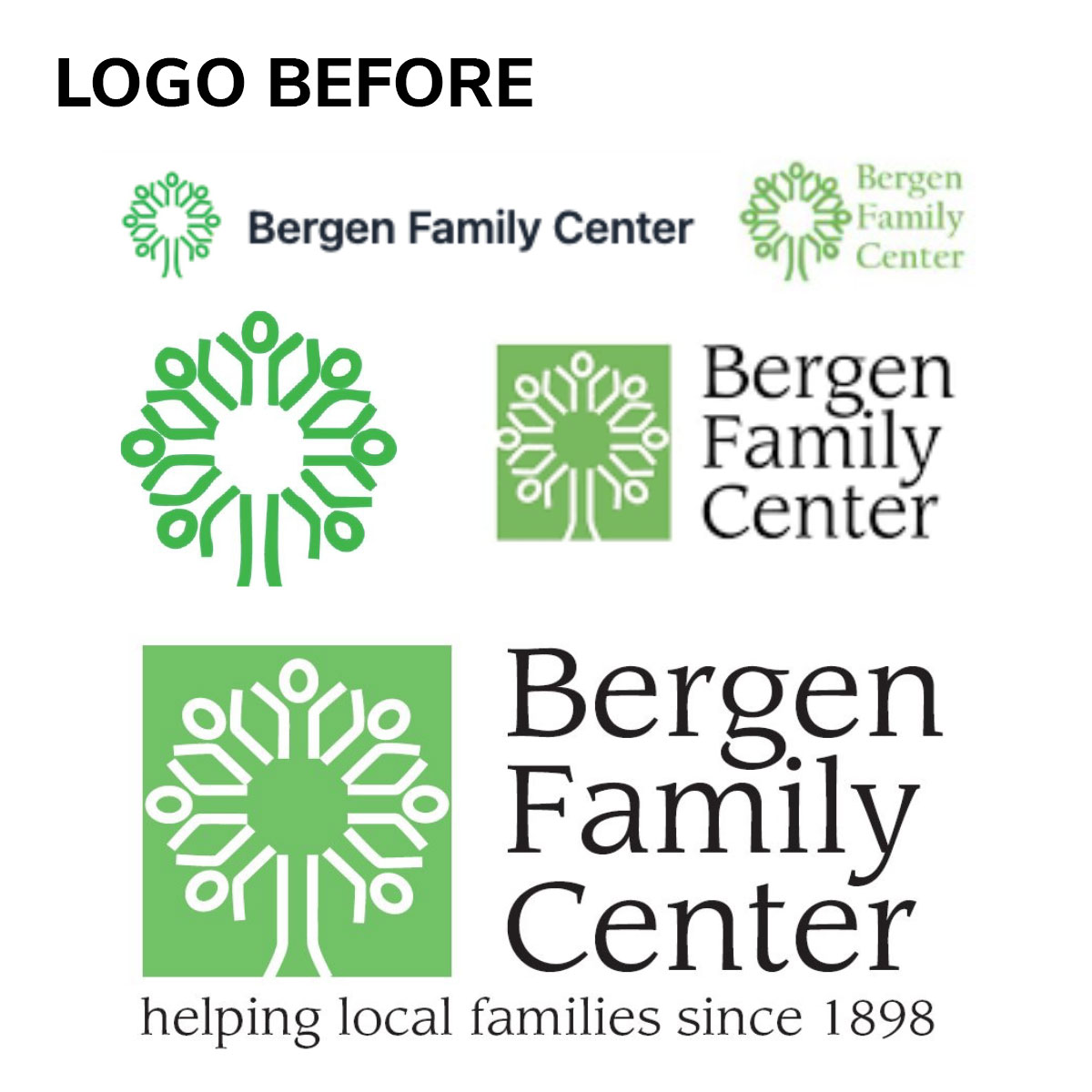
Bergen Family Center came to us looking for greater consistency in its visual identity. Over time, different versions of its logo had been created using different shades of green and blue.
During the project, one team member preferred an all-green version because it visually connected the logo’s tree symbol to the organization’s name.
It was a reasonable preference. But which green would work best?
Bergen serves people across generations, including children, families, and older adults. Its audiences also include people with different language and accessibility needs.
A light, minty green might feel friendly and playful, but it could be difficult to read. It might also suggest an organization focused mainly on children.
A dark forest green could offer stronger contrast, but it might make Bergen feel more serious or formal than intended.
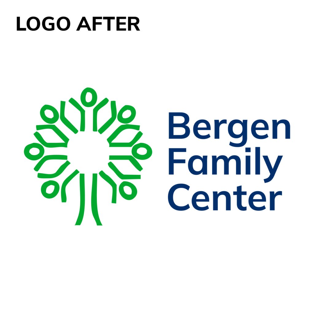
We selected a green that felt bright and welcoming while providing enough contrast for the tree symbol and large text. But that same green wouldn’t meet accessibility standards for smaller lettering.
So we paired it with a dark blue for the organization’s name. The blue provides the readability needed at smaller sizes and gives Bergen another color option to emphasize in communications for its adult audiences.
The result is a consistent identity that balances accessibility with a personality that feels appropriate for people at every stage of life.
When More Color Isn’t the Answer
Fair Labor Association faced a different color challenge. Its newly designed logo featured three shades of blue — light, medium, and dark — but the organization wanted more colors to work with.
We expanded the palette with neutral grays, yellow, coral, green, and black, giving the team more options for creating materials.
But as we explored how to use those colors, we found that bringing the brighter shades into some designs could distract from the content.
Fair Labor’s work centers on labor standards and responsible workplace practices. Its materials need to communicate serious information clearly and convey the credibility that audiences expect from the organization.
For most materials, a more restrained combination of dark blue, medium blue, and light warm gray better supported that work.
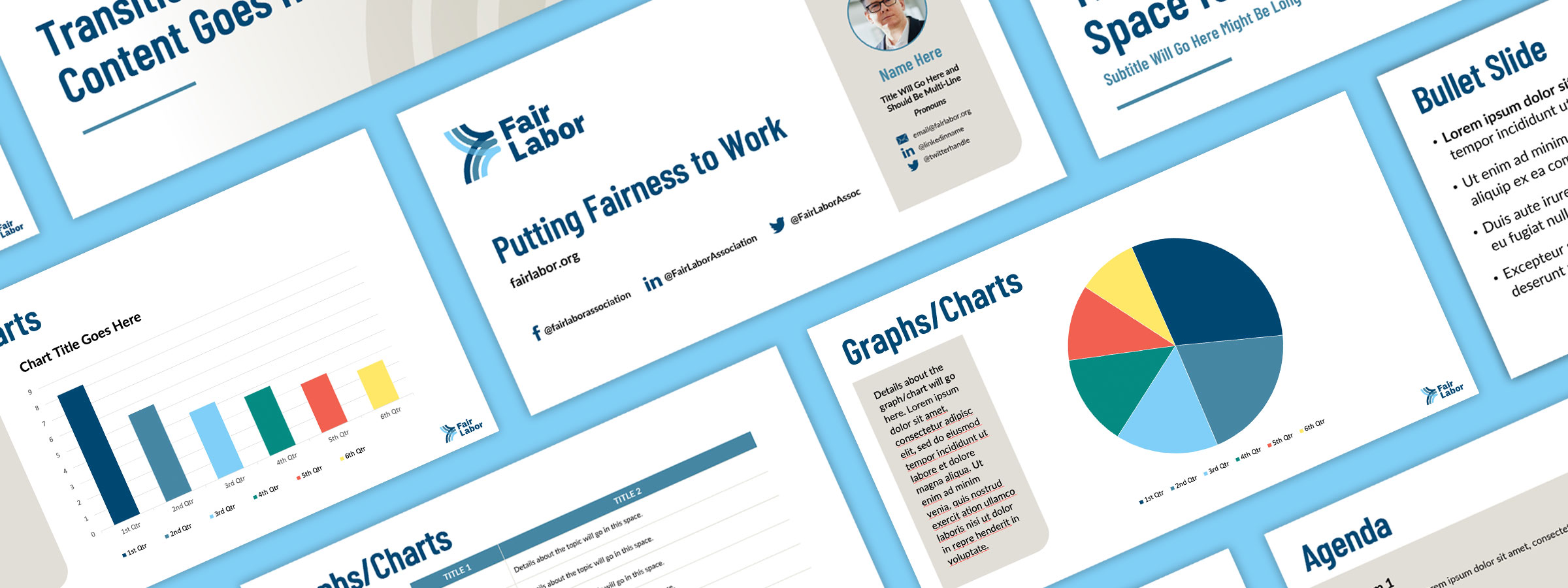
But the expanded palette still had an important role.
Fair Labor regularly communicates information through charts and graphs. In those applications, the additional colors helped distinguish information and make the data easier for readers to interpret.
Rather than using every color to give the materials more visual energy, we gave each one a purpose.
The Right Color for the Right Reasons
Whether you’re developing a new visual identity or finding that your current colors aren’t working as well as they could, consider what they’re communicating about your organization, how accessible they are, and whether they give you the flexibility you need.
You may find that your existing palette works well. Or that a few thoughtful adjustments could make it work better.
If you’d like help figuring that out, let’s talk.