A brand can look polished and still fail the people it’s meant to serve.
The logo can be updated. The colors can feel fresh. The templates can look consistent. The website can feel modern.
But if people can’t read it, navigate it, understand it, or use it, the brand is not doing its job.
That is why access belongs in the brand system from the beginning.
A Brand Has to Work for Real People
Accessibility can sound like a technical requirement.
But the reason it matters is simple: can people use what you create?
Can they read it clearly? Find what they need? Understand what you are asking them to do? Move through the experience without unnecessary confusion or friction?
For organizations that serve broad audiences, that matters every day. Residents looking for services. Students trying to navigate a university site. Donors reading a campaign update. Members registering for an event. Families scanning a flyer on their phone.
Even while centering your brand on your Lovers, people interact with your brand in different contexts, on different devices, with different needs.
A strong brand system needs to account for that.
Access is a Brand Promise
For Montgomery County, PA, access became the common thread in the brand strategy.
Access to parks, services, communities, transportation, business opportunities, and places to call home.
That idea shaped the direction of the new brand identity, Montgomery County: Opportunity on Every Path.
But access could not only be something the brand said.
It had to be something the system supported.
That meant thinking about how the identity would work across public-facing communications, official government materials, department needs, templates, and everyday tools the County’s team would use after launch.
Because a brand built around access must be accessible in practice.
Accessibility Shapes Design Decisions
When accessibility is built into brand design, it affects the choices that make the system usable.
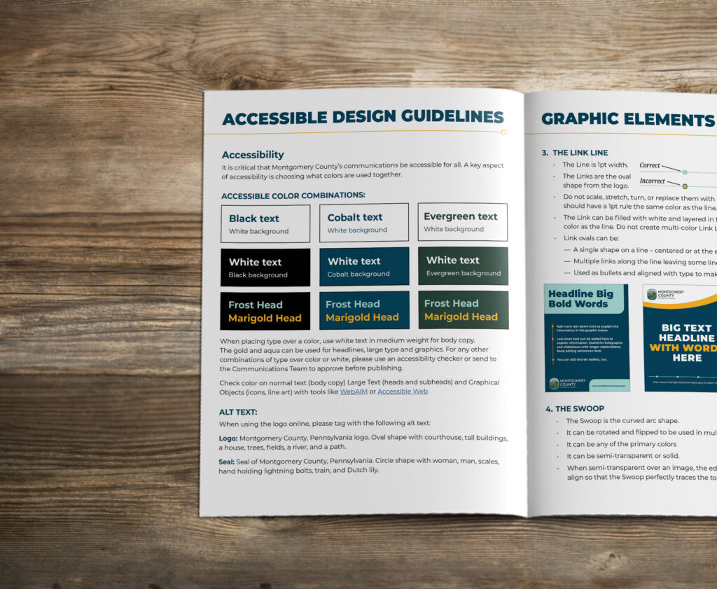
It shows up in color, contrast, typography, and hierarchy. Text must be readable. Information must be easy to scan. The system must work across print, digital, presentations, and templates.
That means accessibility has to be translated into practical brand guidelines. Can the palette communicate clearly when people perceive color differently? How small can type get before it becomes hard to read? What should headings, buttons, links, and calls to action look like? How should templates be structured so staff can keep materials clear and consistent?
For digital materials, those decisions become even more important. The design needs to support different screen sizes, clear navigation, readable layouts, and content that can be understood by people using different tools and technologies.
These are not just production details. They are brand decisions.
And rather than constraining the brand, make the work more useful.
Is your Brand Designed to be Used?
Look across your materials. Your website. Your emails. Your flyers. Your reports. Your presentations. Your social graphics. Your templates.
Do they work together?
Do they help people understand what you offer, what matters, and what to do next?
Are your colors giving you enough flexibility to deliver universal design?
Or does accessibility only come up after something has already been designed, when color, type, layout, and structure are harder to fix?
A brand system should help people recognize you. But it should also help them understand you, trust you, and engage with you.
Need a brand system that is designed to work for the people you serve? Let’s talk about building access into the brand from the start.