A website can have all the right information and still be difficult to use.
If people have to work too hard to find what they need, understand what they’re seeing, or figure out what to do next, the problem isn’t necessarily the content.
It may be that the website wasn’t designed around them.
Usability isn’t something you add after a website is designed. It starts with understanding your audiences and what each of them needs to accomplish.
One Website, Three Audiences
DocuBank helps ensure that members’ Healthcare Directives and other critical medical information can be delivered when needed.
Its website serves three distinct audiences: members, professional partners, and healthcare professionals.
They may all begin on the same public-facing website, but they aren’t looking for the same information or trying to get to the same place.
Members and professional partners each have separate, password-protected sections designed around their specific needs. Healthcare professionals use the public-facing site to find the information and tools intended for them.
On the previous website, professional partners and healthcare professionals could struggle to find features intended for them. Members, meanwhile, could miss tools that allowed them to add medical information that might be critical during an emergency.
The information was there. The challenge was making it easier for the right people to find and use it.
Let the Audience Shape the Design
Addressing those issues started with considering what each audience came to the website to do, what they needed to understand, and where they might get stuck.
For members, we also drew on personas we had previously developed with DocuBank — from people who were new to the service to those who had used it for years.
Those audience needs shaped decisions throughout the website, including navigation, forms, buttons, and page layouts across both the public-facing website and the password-protected member and partner sections.
Because when you know who needs to use your website — and what they need to accomplish — you can make better decisions about how it should work.
Accessibility Is Part of Usability
Making the website easier to navigate wasn’t only about reorganizing information. People also needed to be able to clearly see and use the links, buttons, and other elements that helped them move through the site.
Clear, visible controls matter for every audience. And with many older adults among DocuBank’s membership, we paid particular attention to choices that could make important information harder to see.
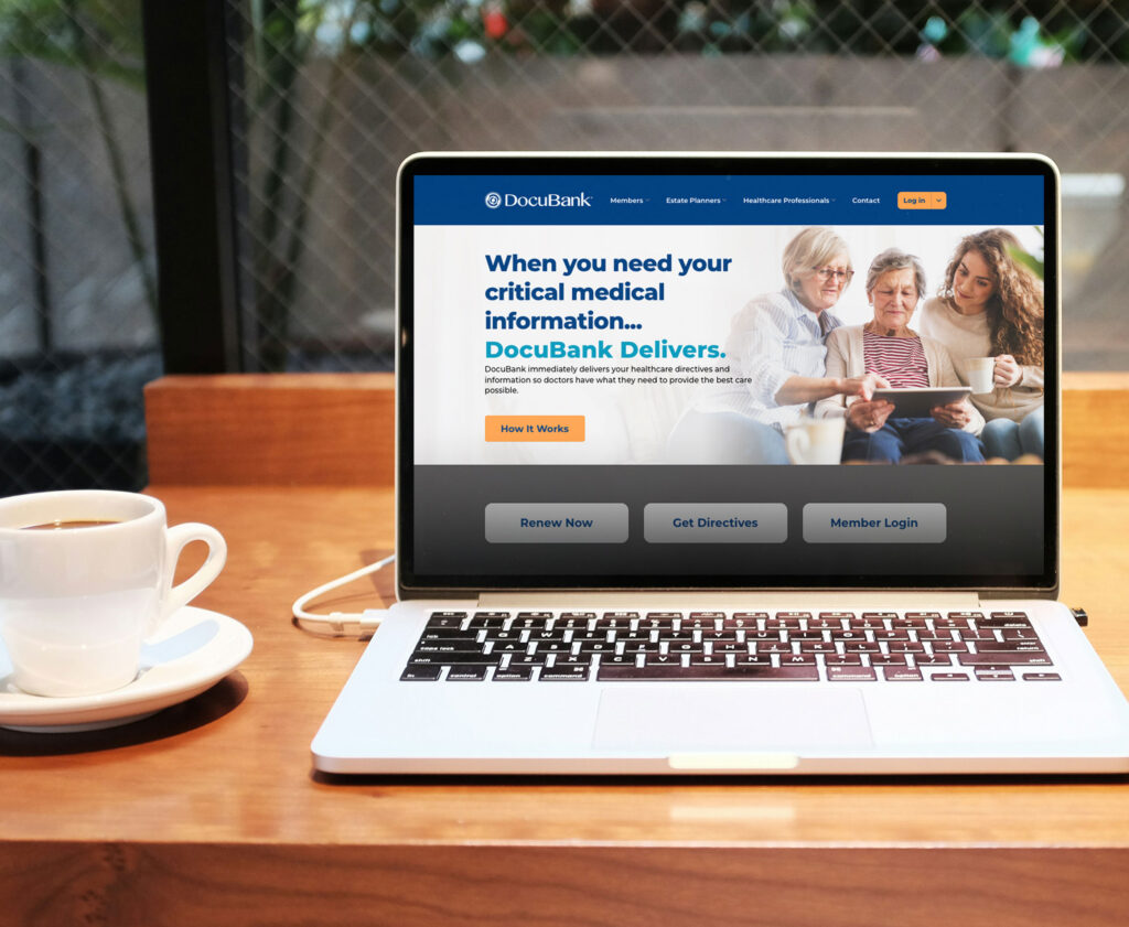
DocuBank’s aqua and orange brand colors are an important part of its visual identity. But on the website, some color combinations did not provide enough contrast for text, links, and buttons.
The answer wasn’t to abandon the brand. We made subtle adjustments to improve visibility while keeping DocuBank’s established visual identity intact.
Making Your Brand Work Better
Navigation, accessibility, and design all shape whether people can find what they need and accomplish what they came to do.
That’s why usability isn’t something to address after the design is underway. It’s part of building a website around the people you need to reach.
If you’re planning a new website, start with your audiences — what they need to know, what they need to do, and what could get in their way.