
Logo Refresh, Color Palette, Graphic Style, Brand Guidelines, Templates, Training

Bergen Family Center
Building a Visual Identity for Every Stage of Life
Brand Strategy & Identity
Overview
Bergen Family Center provides programs and services for people across generations, from young children and families to older adults. It needed a visual identity that could adapt to these different audiences while keeping the organization recognizable across its communications.
Over time, multiple versions of Bergen’s logo had developed, with differences in colors and typography. The logo featured a tree symbol that was already recognizable, but Bergen didn’t have a consistent graphic style to connect its marketing materials.
We worked with Bergen to refine its existing logo, develop a graphic style that could span its different programs, and create guidelines to help the team use its visual identity consistently.
Updating the Logo Without Starting Over
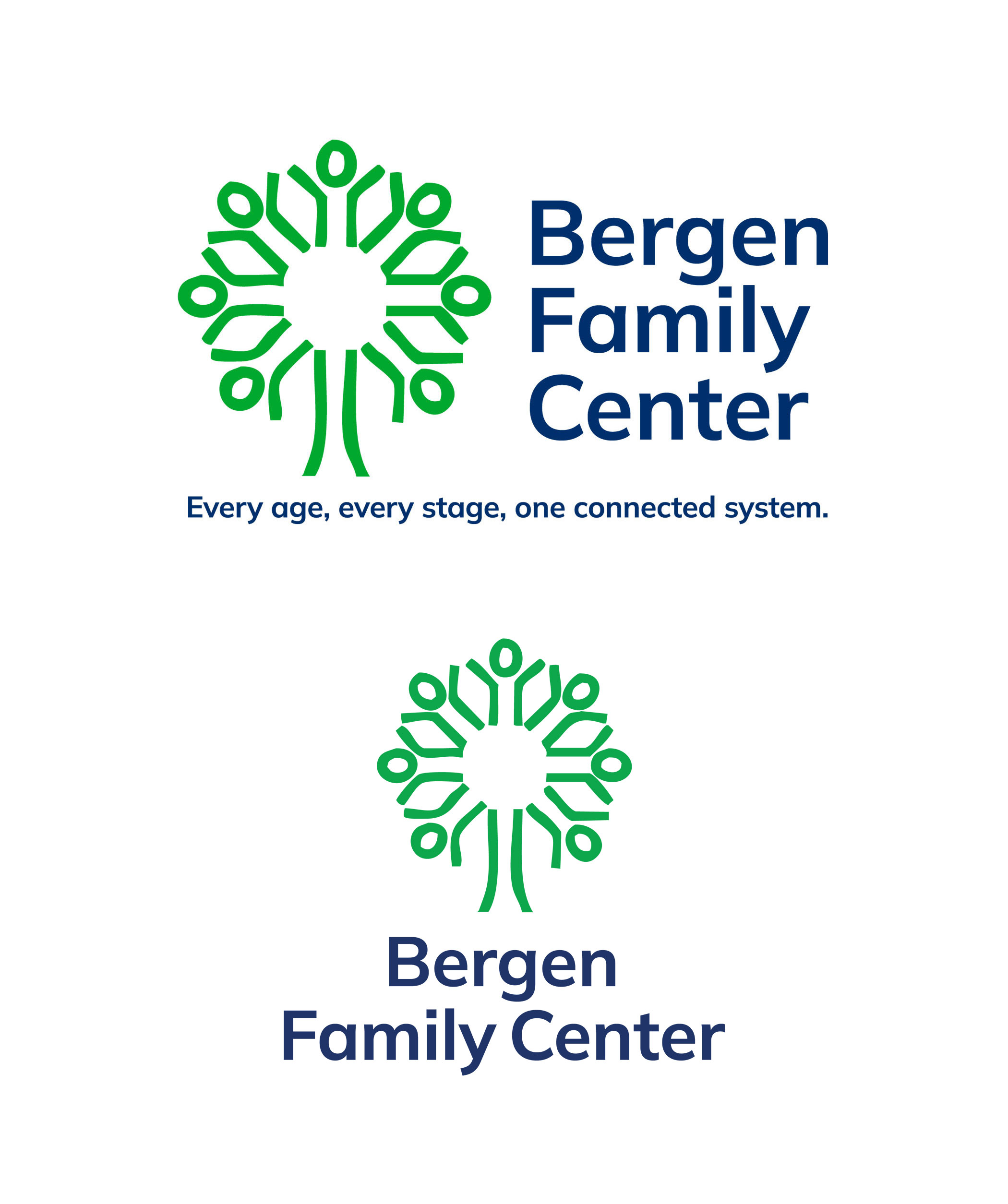
Rather than introducing an entirely new logo, we preserved Bergen’s recognizable tree symbol while refining its typography, standardizing its colors, and developing a complete set of approved versions.
Color was an important part of the process. Bergen needed an identity that felt welcoming to children and families while remaining appropriate for adult programs. It also needed to be readable for people with different accessibility needs.
We selected a bright green for the tree that maintained sufficient contrast for the symbol and large text. We paired it with dark blue lettering, which could remain readable at smaller sizes and give Bergen another color to emphasize in communications for adult audiences.
Finding a Graphic Style Within the Tree
A logo provides recognition, but it doesn’t give staff everything they need to create a brochure, presentation, or social media graphic.
For Bergen, the tree offered an opportunity to build a visual language that would extend beyond the logo itself.
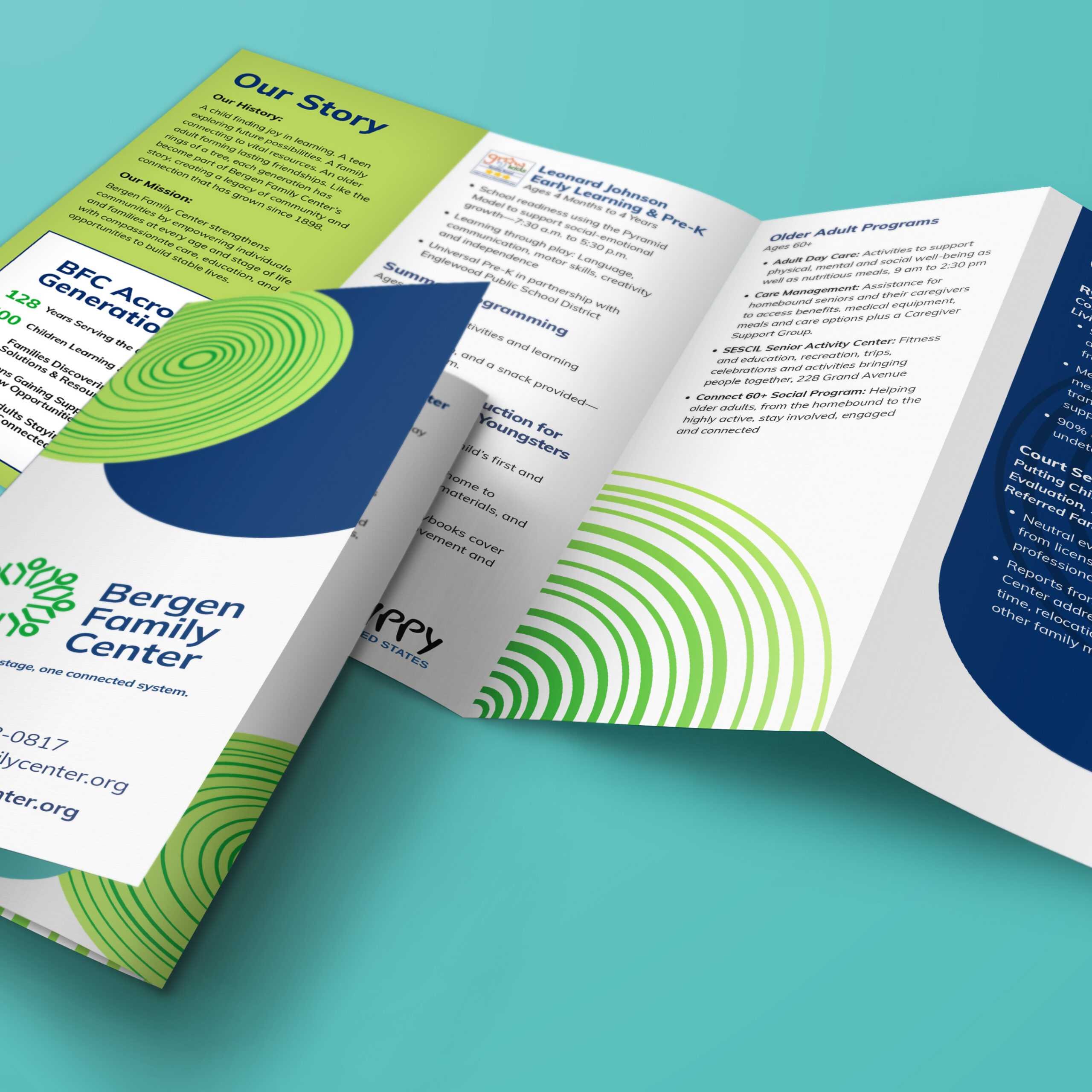
We developed circular graphic elements inspired by tree rings, connecting the design to ideas of growth and the different stages of life.
Rather than creating a separate look for every program, we built variation into a single graphic system. Youth-focused services use fewer rings, while programs serving older adults use more.
This gives individual programs a recognizable visual element without creating separate identities. Materials can look different based on their purpose and audience while still feeling connected to Bergen Family Center.
“I’m so in love with the tree ring concept you came up with. I’m using it when I speak to everything now. It’s a great conceptual idea that explains the range of ages and stages we cover.”
— Rachel Cohen, Senior Director of Community Health and Outreach
Making the System Useful for the Team
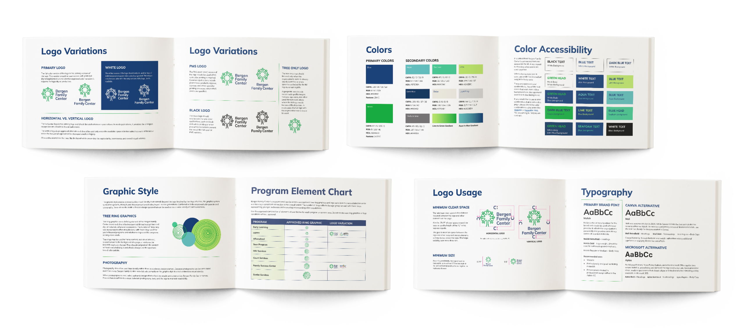
With the logo and graphic style established, we developed a brand style guide documenting how the identity should be used and trained the team on how to use the system.
The guide covers approved logo variations, color combinations, typography, program graphics, and applications across print and digital communications. It also provides direction for social media, presentations, partner logos, and other materials the team regularly needs.
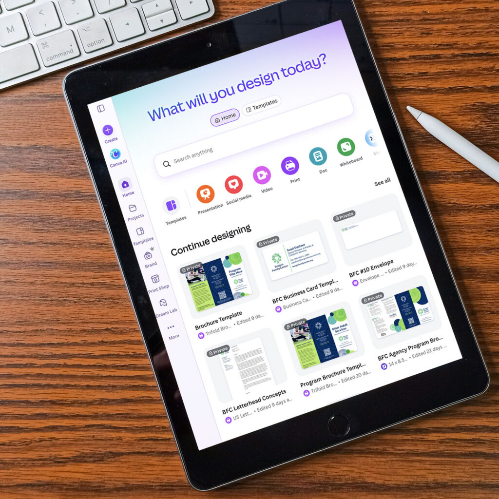
Because Bergen’s staff uses different tools to create communications, we identified appropriate fonts for professional design software, Canva, and Microsoft Office. The guide also explains how to use Canva’s Brand Kit and the custom designed templates to help maintain consistency.
These details make it easier for staff and outside vendors to apply the identity without making new design decisions for every project.

A Connected Identity Across Generations
Bergen’s updated identity gives its team a clear starting point for future communications. Whether they’re creating materials for early learning programs, family services, or older adults, they have a shared visual system that keeps the organization recognizable while allowing each program to speak to its audience.
By building on the existing tree symbol and developing a graphic style that connects Bergen’s programs, we helped create an identity that can adapt to different needs without losing its connection to the organization.
How Can We Help?
Need help building a brand that connects? Contact us to start building stronger relationships and better engagement for your organization.