When we talk about brand voice, we usually mean words.
Friendly or formal. Warm or direct. Playful or professional. The way you write tells people how to hear you.
But your visuals have a voice too.
Color, typography, spacing, graphic style, layout, and logo placement all send signals. Together, they shape whether your organization feels approachable or distant. Official or casual. Modern or dated. Clear or complicated.
And just like written voice, visual voice can be intentional.
Or it can be accidental.
Modern Can Mean a Lot of Things
A lot of visual identity projects start with a familiar request: make it feel more modern.
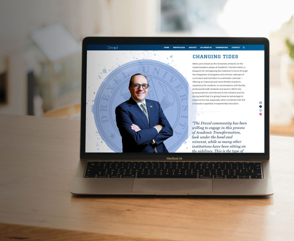
That was part of the challenge for Montgomery County, PA. The County needed a visual identity that felt current and more public-facing than its traditional seal. But “modern” was not enough direction on its own.
Sleek and corporate can be modern. Bright and energetic can be modern. Simple and restrained can be modern. Warm and open can be modern.
The question was not only how to make the identity feel newer. It was how to make it feel right for the County, its audiences, and the role it needed to play.
The identity needed to feel official, but not cold. Current, but not trendy. Flexible across departments, but still connected. Public-facing, but still trustworthy.
A visual identity designed mainly to attract businesses might have looked very different from one designed to help residents recognize themselves in the place they live. For Montgomery County, the visual style needed to reflect the County’s real role: connecting people to services, communities, transportation, business opportunities, parks, and places to call home.
That focus on access became the foundation for the new brand direction we developed with the County: Montgomery County: Opportunity on Every Path.
Style Carries Meaning
Once the strategy was set, the visual system had a clearer job.
The primary logo, official seal, department logo system, and graphic style all needed to support a County brand that felt useful, accessible, and connected across many different needs.
That does not mean everything had to look identical.
A good visual system needs room to flex. A formal government communication should not feel exactly like a community announcement or a social graphic. But they should still feel like they are coming from the same organization.
That is the difference between making things match and making things connect.
What Is Your Visual Voice Saying?
Look across your materials. Your website. Your presentations. Your reports. Your social graphics. Your event collateral. Your department templates.
Do they feel like the same organization?
Do they match the tone you want to set?
Do they help people trust, understand, and recognize you?
Or are they creating a voice you would never choose on purpose?
A strong visual identity is not just about looking polished. It helps your organization communicate with the right tone before anyone reads a word.
Need a visual identity that communicates with purpose? Let’s talk about the strategy behind your style.