
When a publication moves to an online format, the reading experience can get lost.
Not because digital is the wrong choice. Moving online can make a publication easier to share, easier to search, easier to measure, and easier for readers to act on.
But too often, that transition means choosing between formats that solve one problem while creating another.
A PDF or page-flipper may preserve the printed layout, but it does not always create a strong reading experience online. A blog makes stories easier to find and share, but it can flatten the publication into a series of separate posts that all feel the same.
And a magazine is not just a place to put articles.
It has rhythm. Hierarchy. Feature moments. Visual storytelling. A sense of what matters most. When that experience disappears, even your best stories can start to feel smaller than they are.
Design the Experience, Not Just the Format
A strong digital magazine should feel designed for the way people read online without losing what made the original publication worth reading.
That means thinking beyond the article page.
How should the issue open? Which stories need more visual space? Where should photography lead? Where can video, galleries, links, or interactive elements add meaning? How does the reader move from one story to the next? What action do you want them to take while they are engaged?
These are publication questions, not just digital questions.
And they matter even more when the publication belongs to a larger brand. Alumni magazines, member publications, research reports, and annual publications all have to carry the identity of the organization while creating an experience that feels distinct enough to invite people in.
Designing for How People Actually Read
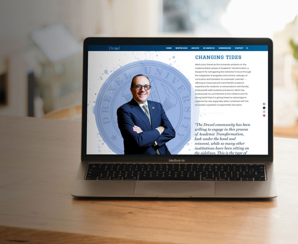
When Drexel University moved its alumni magazine into an online format, the opportunity was bigger than putting stories on a screen.
The publication needed to keep the quality, pacing, and visual impact of a magazine while taking advantage of what an online format can do better. That meant designing around how readers would move through the publication, understand the stories, recognize the brand, and know what to do next.
The same choices that make a publication feel designed also determine whether people can actually use it.
In print publications, typography, hierarchy, photography, and pacing help guide the reader through the issue. In an online publication, those same choices must do more than shape the reading experience on the page. They have to account for readability, navigation, screen size, content structure, links, and the many ways people move through digital content.
For universities and other complex organizations, accessibility cannot be treated as a final check after the design is done. It has to be built into the publication from the beginning, so the experience is not only visually engaging, but usable.
Making Participation Easier
For Drexel, one of the clearest shifts was how the digital format supported participation.
Instead of asking alumni to move from a printed publication to a separate next step, the online magazine could bring those opportunities into the reading experience. Readers could move from a story to a submission prompt, class note form, or a poll question with less friction.
Since turning the magazine into an interactive online publication, submissions have increased, giving readers a clearer path to contribute.
That is the value of designing the experience, not just moving the content.
Don’t Let the Format Flatten the Story
If your organization has a publication people care about, delivering it online should not mean losing the things that make it feel meaningful.
Your magazine still needs to feel like an experience.
Need to move a publication online without losing what makes it worth the reader’s time? See how Iris helped Drexel turn its alumni magazine into a digital experience built for story, brand, accessibility, and engagement.