For large events, countless elements need to be created.
It’s easy to consider save the dates, invitations, programs, social media posts, and websites when thinking about design but it doesn’t stop there. The “invisible” labor of event design also shows up in things like signage, lanyards, name tags, headers for emails, cover images on social, and more.
Consistency matters when working to create a cohesive event experience.
Developing a look that’s recognizable across all the ways you need to deploy it will make your marketing work better for you and your audience.
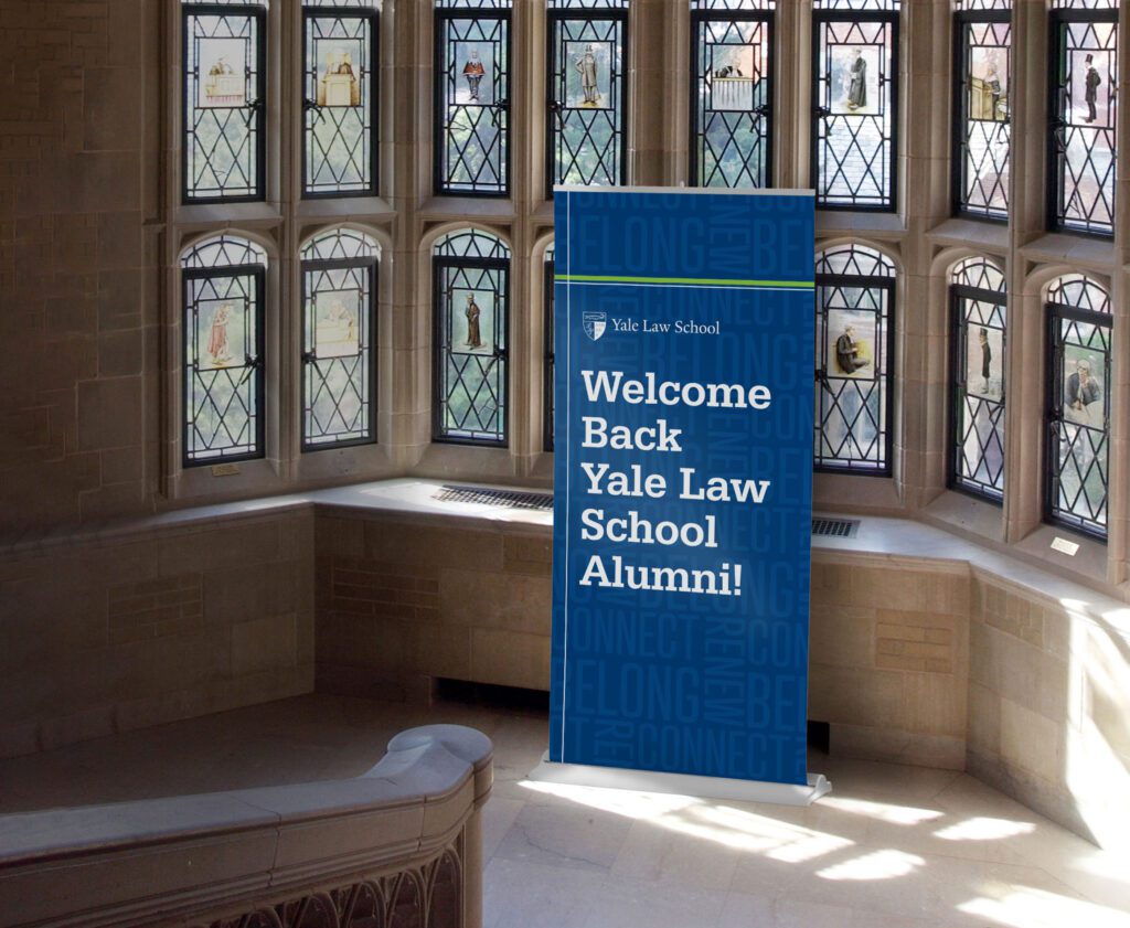
The work we’ve done for Yale Law School’s Alumni Weekend is a perfect example of this.
The event doesn’t have a logo, so we created a distinctive visual with typography using the event theme words. We then took that concept and turned it into a pattern that we could use to tie the event marketing together. The pattern was printed in high gloss coating on postcards and invitations, and repeated as a background on website buttons and on-site signage.
Extra umph
Color and typography can do a lot to make event materials recognizable, but a distinctive and flexible graphic adds power. It’s especially helpful when we are sharing the load of content creation with clients.
We talked about this idea last week on our community webinar about event branding.
Sometimes the budget won’t cover outsourcing everything, so we’re engaged to develop the theme, the look, and key design pieces. Then we provide templates, and/or graphic elements to the client so they can be mixed and matched across all the other materials that need to be built in-house or last minute. It’s an efficient collaboration that lets us use our skills where they can be most helpful and conserves budget.
Could you use a little creative collaboration? Schedule a time to talk!