Rebranding Feasibility Study, Tagline Development, Logo Design, Brand Guidelines, Website Design
New England Village
Sometimes Research Reveals the Answers are Simpler than Expected
Brand Strategy & Identity
Overview
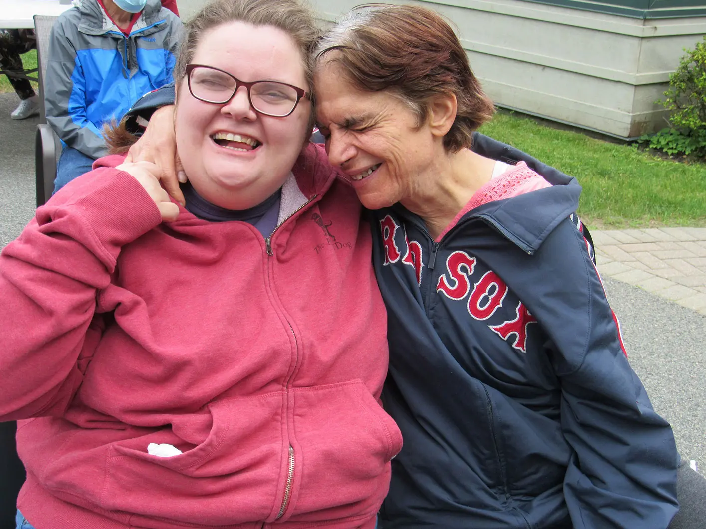
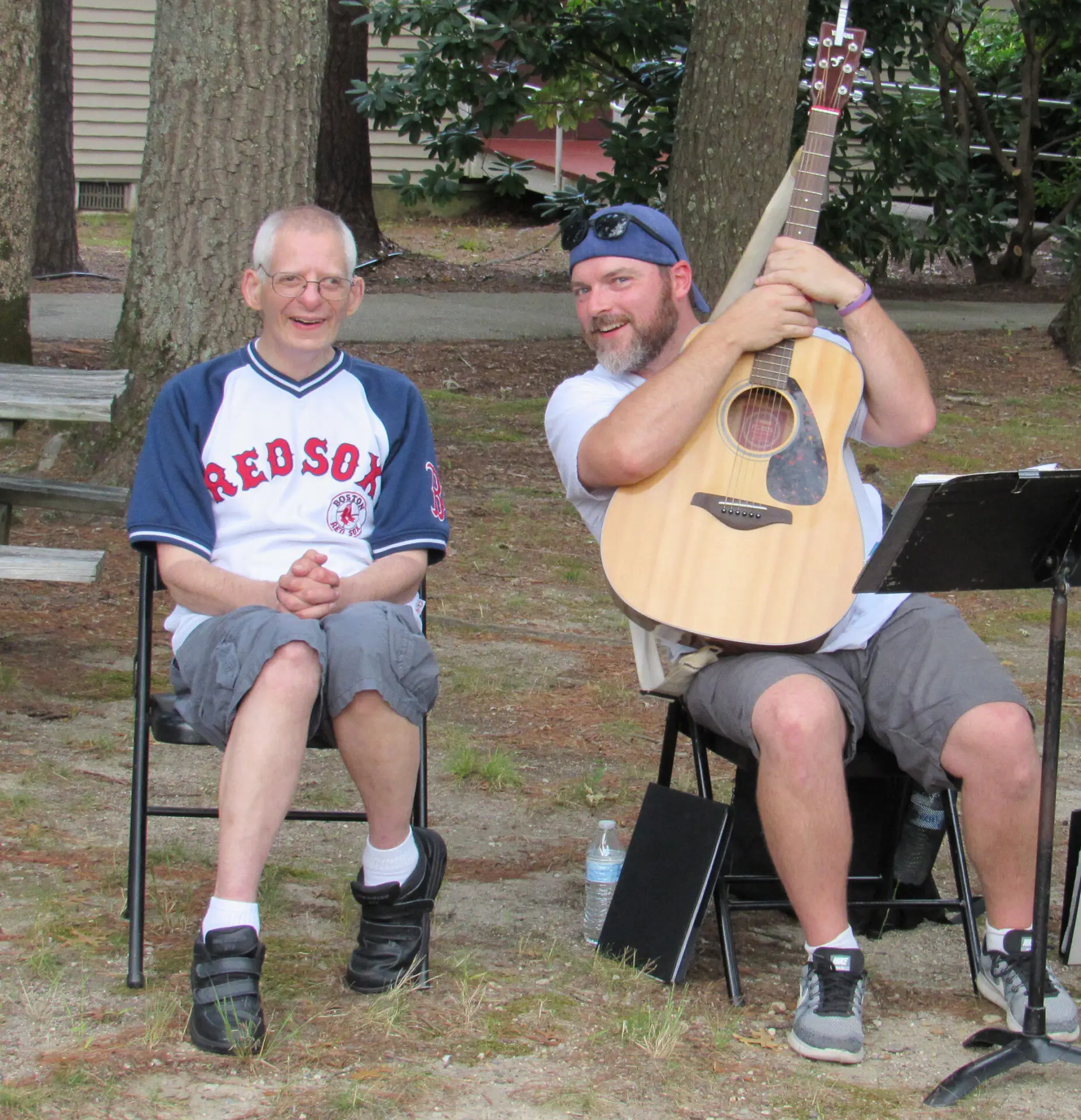
Located in Pembroke, Massachusetts, New England Village (NEV) provides residential services to people with intellectual and developmental disabilities. In addition, they offer a day program and a wellness center for members of the community of all abilities.
In 2014, the funding environment changed drastically for organizations that support people with intellectual and developmental disabilities. The change in funding was an effort to move away from institutionalization. Organizations with significant residential programs struggled to adjust. This funding shift made it harder for NEV to communicate the quality and value of their model to agencies that provide grants for their work. In 2021 under new leadership, NEV decided to explore whether a rebranding would help them address this problem.
Assessing the Feasibility and Necessity of a Rebrand
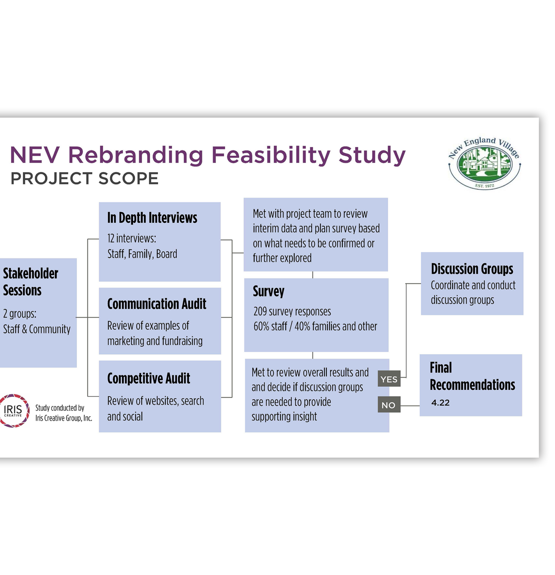
We conducted a Rebranding Feasibility Study using our AMIE method of brand focus. The process helps organizations ensure that their Audience, Message, Image, and Experience are aligned with organizational strategy and financial strength. As part of the study, we conducted stakeholder sessions, in-depth interviews, a communications audit, a competitive audit, and surveys. Our goal was to determine whether anything needed to change at all, and if changes were needed, what exactly needed to change.
The research revealed that, despite the grant funders’ current perspective on residential living, the NEV community knows who they are and why their model works. The idea of a “village” is not literal to them. They believe “it takes a village.” And their core audience agreed. The main problem, most reported, wasn’t the name. It was that NEV had outgrown their logo—a picture of a literal village that reinforced a limited idea of what they were about.
A Tagline to the Rescue
While the name wasn’t the problem it also wasn’t providing much clarity. Through collaborative workshops with key staff members we agreed that a descriptive tagline could be the solution. This choice allowed NEV to maintain the brand equity it already had in its name and reduce the business hassle of a significant change. The new tagline “Connecting People, Purpose, & Passion” serves to excite and inspire their community, their families, and their staff.
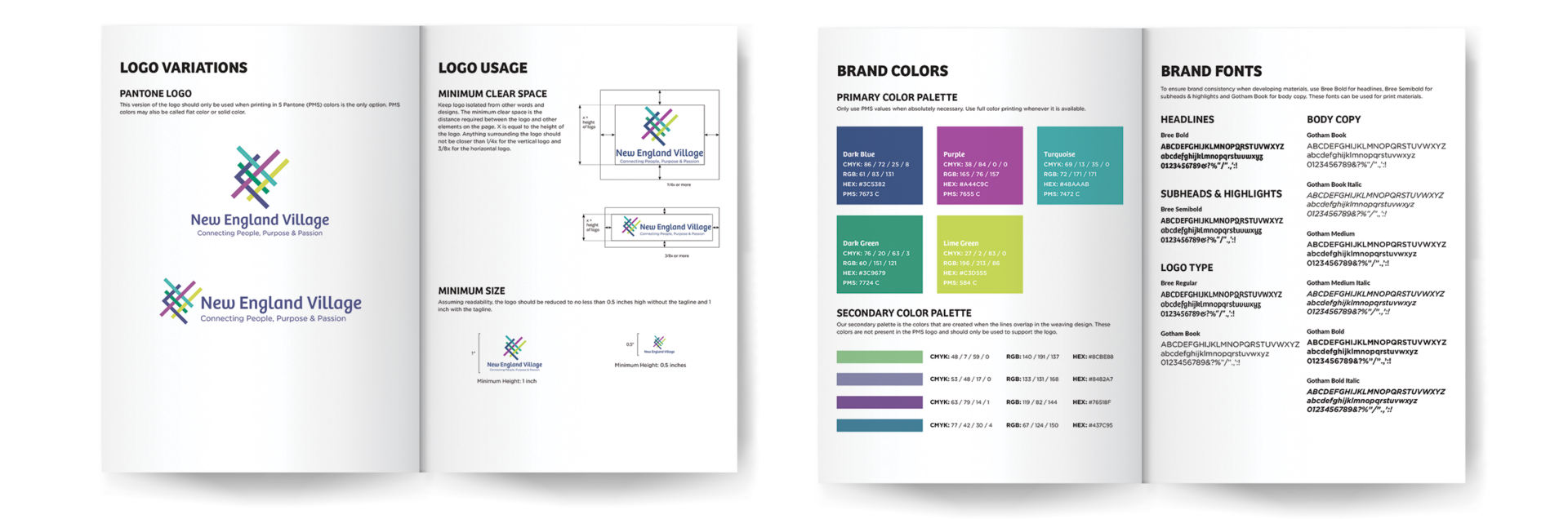
A New Image Builds Pride
We then created a new logo that would complement the tagline and accurately represent the organization. Taking what we learned through tagline exploration and creative brief discussions led us to focus on the idea of interconnectedness. The NEV community is represented through the ribbons which highlight inclusiveness and diversity weaving together. The design, turned on its axis and breaking the borders, represents opportunity, growth, and choice coming together.
Since launching, Dolores Rezendes, Communication Director, let us know that the staff is thrilled with the new look. For employees who love their work despite how hard it is, the new logo is reconnecting them with pride in their organization.
“I was shocked at how much I was able to gain operationally from the process. We learned things I can address in areas well beyond marketing.”
— Stephanie Costa, CEO of New England Village
Building Out the Brand
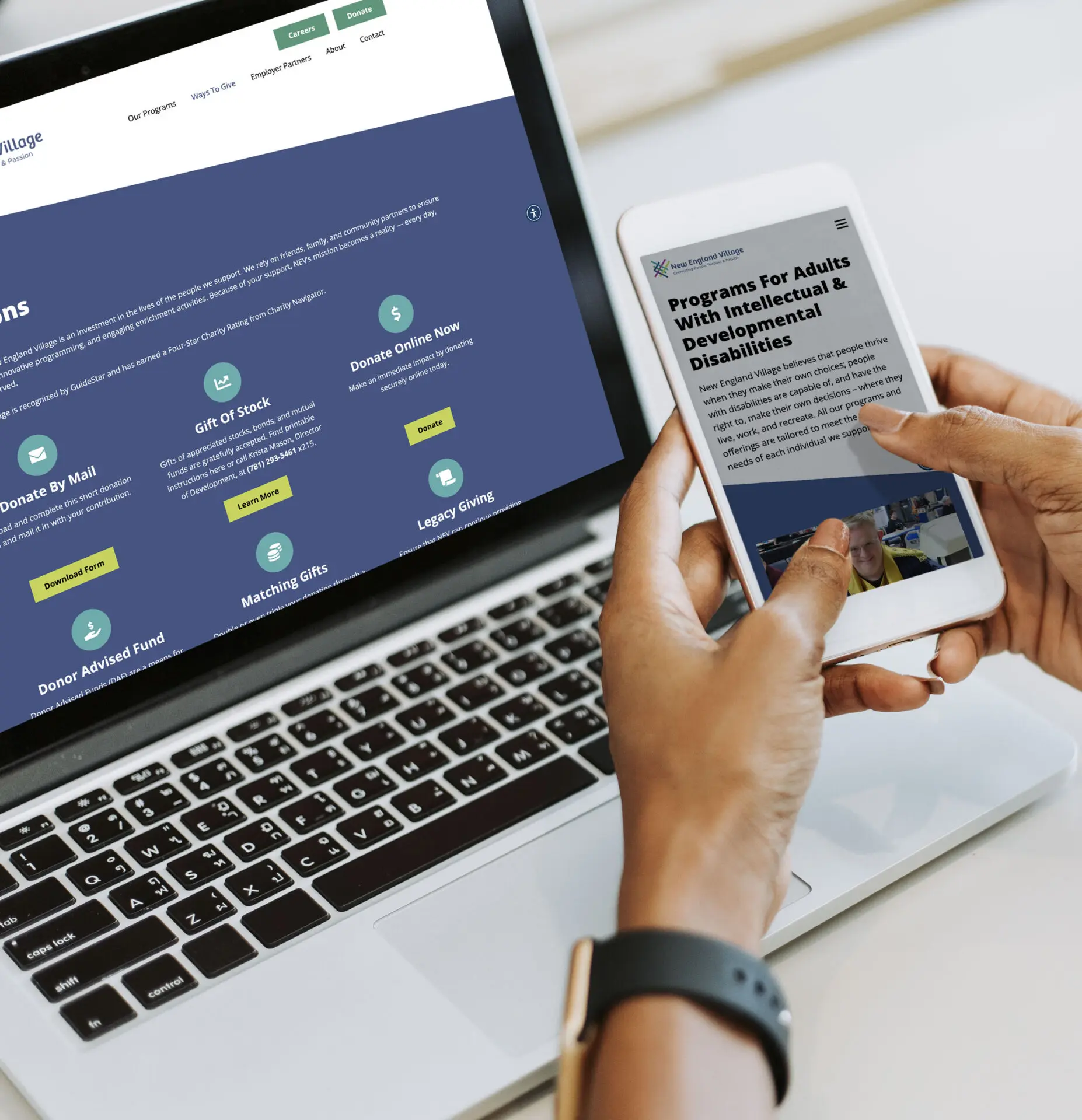
With New England Village’s new identity finalized, we moved to the next phase of the project: the website. The outdated, poorly functioning website needed a major update to support the new brand. As important as it was to have a beautiful front-end, it’s critical that the backend is developed so it can be easily maintained. With NEV’s small marketing team in mind, we constructed a site that is intuitive to update for staff while supporting accessibility for their audience.
How Can We Help?
Need help building a brand that connects? Contact us to start building stronger relationships and better engagement for your organization.